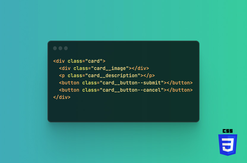
Global styles in CSS needs to be used with care. Creating too many global classes, can have unwanted consequences, be hard to maintain and force you into using !important.
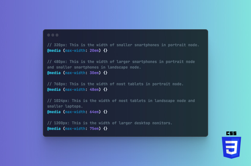
Media queries are a fundamental technique in making a website responsive and mobile-friendly. Media queries are a way to apply different styles to a website based on the size and characteristics of the device that is being used to view the website.
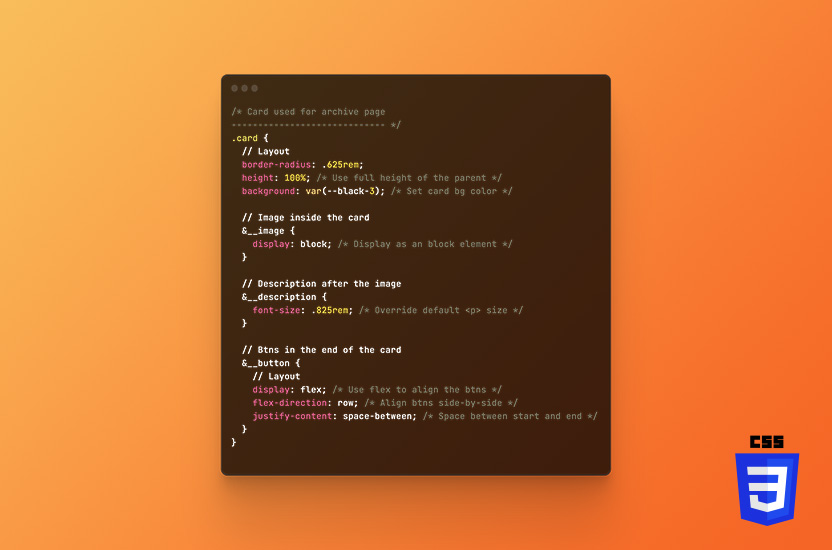
I’ve never been much for commenting my own code, until I realised how much it helps other developers understand my logic, approach and it shorten the time they spend on getting familiar with my projects.
The !important declaration is used too much in modern CSS. If you write proper lean and clean CSS, and target the right classes, you won’t have to use the declaration, and put future you in a pickle.
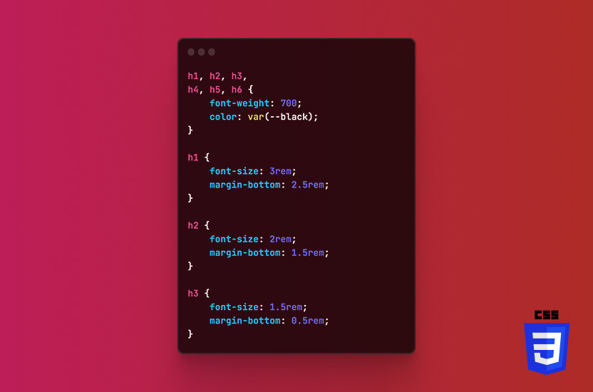
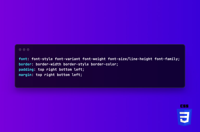
CSS shorthand properties are a powerful tool for creating efficient, concise, and easy-to-read CSS code.
CSS is often mistaken for something easy in Web Development, but it requires quite a bit of skill to master. Even after almost 10 years of working with CSS, I’m learning new approaches, handy tips, and tricks to create even leaner code.
It took me a long time to move away from XAMPP, which had been my go-to dev. environment since 2014. That was when I started developing for WordPress. I tried several other environments from time to time, but nothing every really stuck, until I discovered LocalWP.
Accessibility is becoming a more and more critical aspect of web development. Ensuring that all users, including those with disabilities, can access and use your website.
WordPress is one of the most popular content management systems out there, powering 43.2% of all websites on the internet as per February 2023.
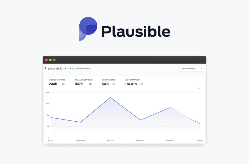
When it comes to tracking website analytics, Google Analytics has long been the go-to tool for businesses and website owners. However, with the increasing concern around privacy and data collection, many are now seeking out alternative solutions.