Media Queries: CSS Best Practices, Part 5
Media queries are a fundamental technique in making a website responsive and mobile-friendly. Media queries are a way to apply different styles to a website based on the size and characteristics of the device that is being used to view the website.

Media Queries allow web developers to optimize the website layout and design for different devices and screen sizes, ensuring that the website looks good and works well on a variety of devices, from desktops to smartphones.
Best Practices for Media Queries
Best practices for using media queries to make your website responsive and mobile-friendly include:
Use relative units:
Use relative units such as ems or rems for sizing elements, rather than fixed pixel sizes. This allows the website to scale up and down depending on the device screen size.
Using rem (root em) is a solid choice, as it is based on the font size of the root element, typically the HTML element. This makes it easy to set a consistent size across the entire site, which can be helpful in maintaining a consistent design across different devices. However, since it is not relative to the parent element, it can be more challenging to adjust the size of specific elements in relation to others.
Pixels are an absolute unit, which means they always stay the same size regardless of the font size of the parent element. This makes it difficult to create a flexible and scalable layout and can make it challenging to maintain a consistent design across different devices. Additionally, using pixels for media queries can lead to inconsistent behaviour on high-resolution screens, where the same number of pixels will result in a smaller physical size.
Using ems or rems for media queries allows for a more flexible and scalable layout, making it easier to create a responsive design that looks good and functions well on a range of device.
Personally, I use em as a relative unit for media queries.
Set breakpoints
Set breakpoints at specific screen sizes to adjust the layout and design of the website. This allows the website to look and function well on a range of devices.
Some common breakpoints that are worth setting:
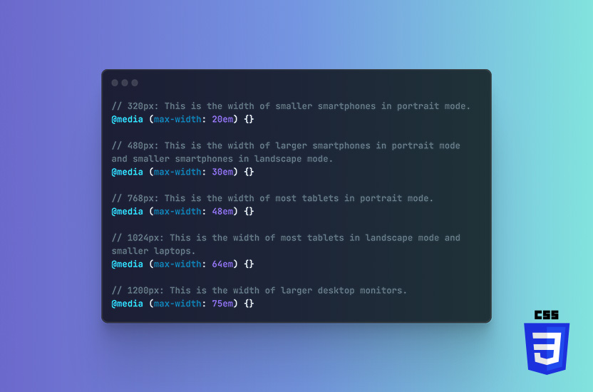
// 320px: This is the width of smaller smartphones in portrait mode.
@media (max-width: 20em) {}

// 480px: This is the width of larger smartphones in portrait mode and smaller smartphones in landscape mode.
@media (max-width: 30em) {}

// 768px: This is the width of most tablets in portrait mode.
@media (max-width: 48em) {}

// 1024px: This is the width of most tablets in landscape mode and smaller laptops.
@media (max-width: 64em) {}

// 1200px: This is the width of larger desktop monitors.
@media (max-width: 75em) {}
However, it’s important to note that these breakpoints are just a general guide. They may not be appropriate for your website. The actual breakpoints that you set will depend on the specific needs of your website and the devices that you are targeting. It’s also worth considering the breakpoints of your framework if you use one.
Honorary breakpoint shoutouts are:
// 568px: This is the width of more modern phones such as iPhones
@media (max-width: 35.5em) {}

// 1440px: This is the width of a Macbook Air
@media (max-width: 90em) {}
Test on real devices
Test the website on real devices to ensure that it looks and functions as intended. This helps ensure that the website is optimized for a range of devices and screen sizes.
Testing on real devices is essential when writing media queries. It allows you to see how your website will actually look and function on a range of devices. While emulators and simulators can be helpful in testing your website on different devices, they are not always an accurate representation of how your website will perform in the real world.
You will also see the experience from a users point-of-view. Testing on real devices allows you to see how your website performs in a real-world setting. That gives you a better understanding of the user experience.
Final words
Developers can use media queries to create responsive and mobile-friendly websites that look and function well on a range of devices. Key is using the right units and finding the right breaking points. Once you have those two in place, testing on real devices will become easier, as things already look the way they are intended.
More CSS best practices
- CSS Naming conventions (Part 1)
- CSS Shorthand Properties (Part 2)
- CSS Avoid !important (Part 3)
- CSS Commenting your code (Part 4)
- CSS Media Queries (Part 5)
- CSS Global styles (Part 6)