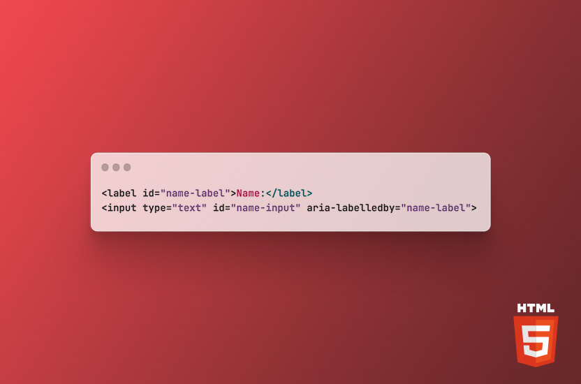
Accessibility is an important aspect of web design, as it ensures that everyone, including people with disabilities, can access and use your website.
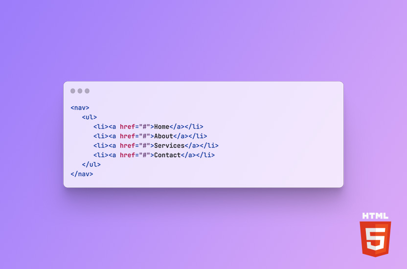
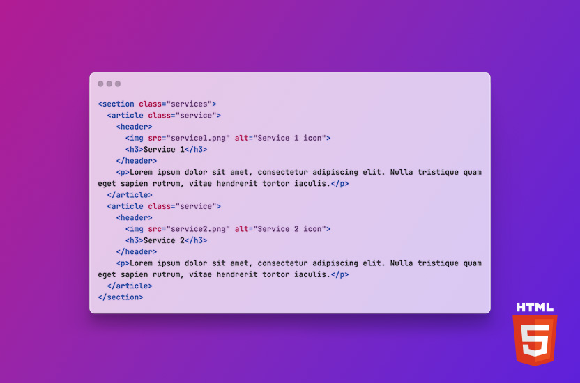
In this blog post, I will focus on some of the most commonly used semantic HTML elements and their purpose.
Semantic HTML is an essential aspect of web development that helps create accessible, SEO-friendly websites. Semantic HTML refers to the use of HTML elements to convey the meaning of content on a web page, rather than just defining its appearance.
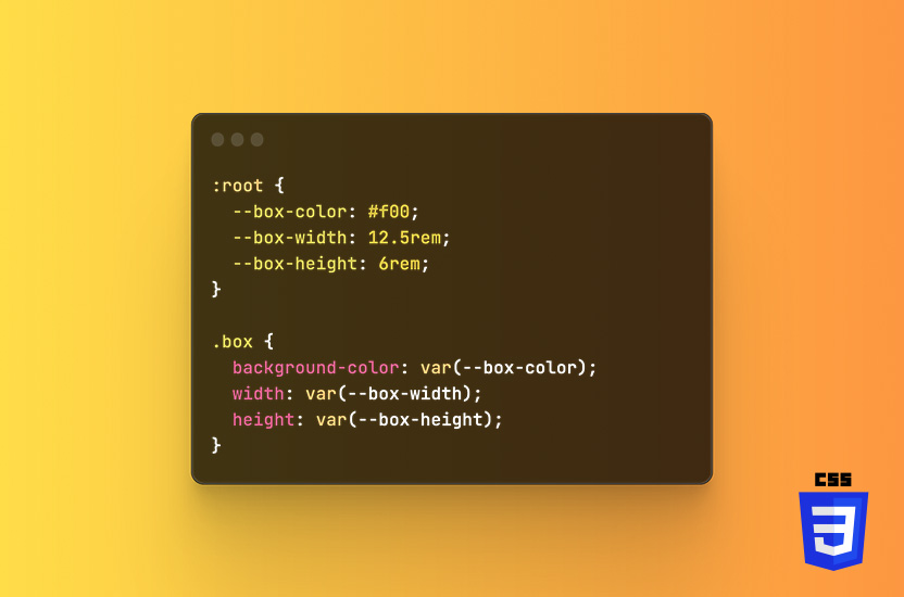
CSS custom properties (also known as CSS variables) allow you to define variables that can hold a value, such as a color or font size, which can be used throughout your CSS.
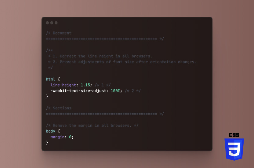
When it comes to web development, CSS plays a vital role in styling a website. However, different browsers have different default styles, which can make it challenging to ensure a consistent look across all platforms. That's where reset CSS comes in.
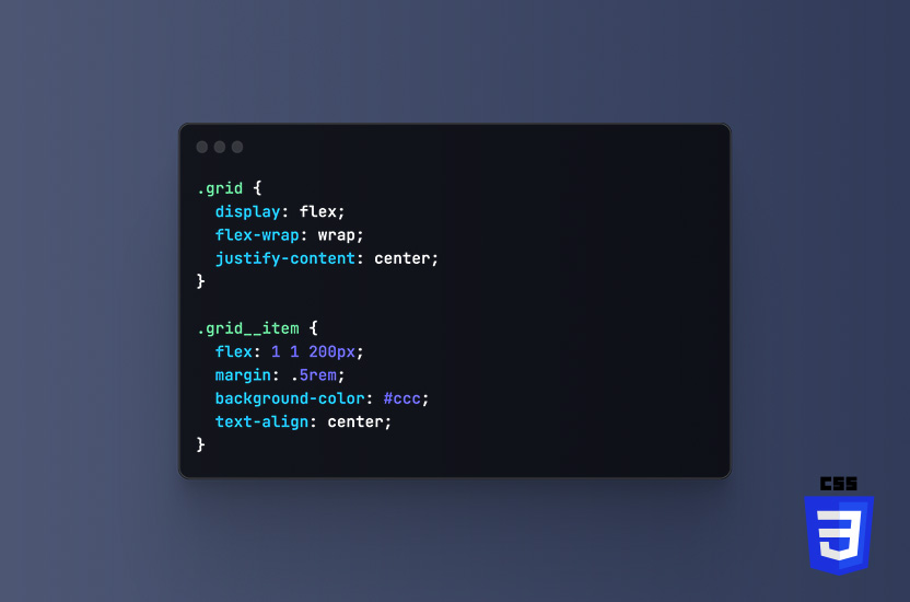
Flexbox is a layout module in CSS that provides a more efficient way to arrange, align and distribute space among items in a container, even when their size is unknown or dynamic.
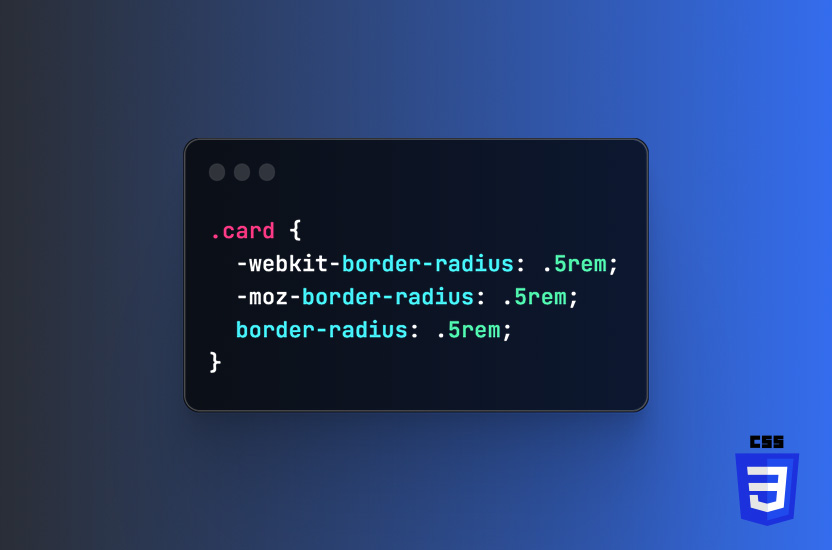
Working with experimental CSS requires you to know about vendor prefixes. Ensuring browser compatibility is important in an everchanging landscape, where new browsers are continuously being introduced.
Global styles in CSS needs to be used with care. Creating too many global classes, can have unwanted consequences, be hard to maintain and force you into using !important.
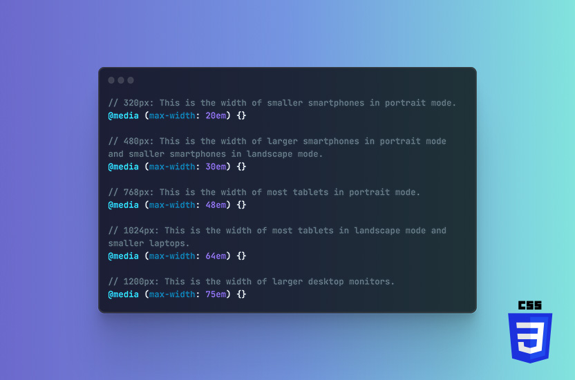
Media queries are a fundamental technique in making a website responsive and mobile-friendly. Media queries are a way to apply different styles to a website based on the size and characteristics of the device that is being used to view the website.
I’ve never been much for commenting my own code, until I realised how much it helps other developers understand my logic, approach and it shorten the time they spend on getting familiar with my projects.