Flexbox: CSS Best Practices, Part 8
Flexbox is a layout module in CSS that provides a more efficient way to arrange, align and distribute space among items in a container, even when their size is unknown or dynamic.

Flexbox allows you to control the alignment and distribution of elements along a single axis or in multiple dimensions, depending on your needs. It also simplifies many common layout tasks that would otherwise require complex and brittle CSS hacks, such as vertically centering content, creating equal-height columns, and arranging elements in a grid.
Some of the benefits of using flexbox in CSS include:
- Responsive design.
Flexbox makes it easy to create responsive designs that adapt to different screen sizes and device orientations. - Efficient use of space.
Flexbox allows you to distribute available space among items in a container, making it ideal for creating layouts that are both visually appealing and efficient. - Simplified code.
You can achieve complex layouts with just a few lines of CSS, reducing the amount of code you need to write and making it easier to maintain. - Cross-browser compatibility.
Flexbox is supported by all major browsers, including IE 11, making it a reliable and widely adopted tool for web developers.
Example
In this example I’ll align the contents of a card between the available space.
Firstly, I’ll create the structure.
<div class="grid">
    <div class="grid__item">Aligned on the left</div>
    <div class="grid__item">Aligned on the right</div>
</div>
Then, using CSS, we align the contents in the available space.
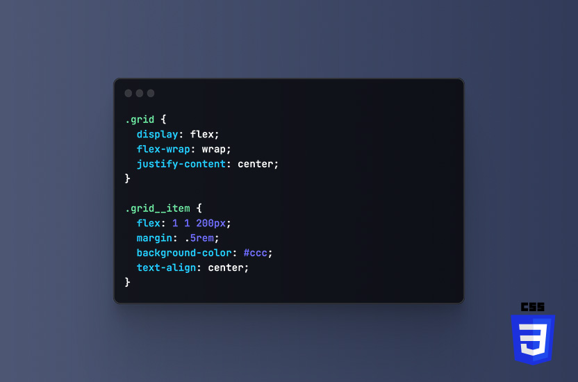
.grid {
    display: flex;
    justify-content: space-between;
}
The display: flex; property activates the flexbox. Then justify-content: space-between; aligns .grid__item between the available space. The first one on the left, and the second .grid__item spaces out to the right.
Flexbox is a powerful tool for creating flexible, responsive layouts that are easy to maintain. The results are also compatible with a wide range of devices and browsers. It’s considered a best practice in CSS because it simplifies many common layout tasks, reduces code complexity, and provides a more efficient use of space.
More CSS best practices
- CSS Naming conventions (Part 1)
- CSS Shorthand Properties (Part 2)
- CSS Avoid !important (Part 3)
- CSS Commenting your code (Part 4)
- CSS Media Queries (Part 5)
- CSS Global styles (Part 6)
- CSS Vendor prefixes (Part 7)
- CSS Flexbox (Part 8)
- CSS Reset (Part 9)